


Share Post


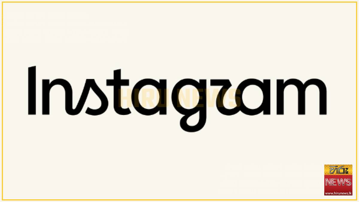
Instagram on Thursday introduced a new wordmark, which is the text-only logo that spells out the company’s name. The social media giant’s logic was that the older version of its logo felt dated after a decade in use.
The change was announced by Instagram head Adam Mosseri on both Instagram and Threads, where he described the new logo as “sharper and more modern” while still referencing the original and maintaining simplicity.
Although people can often be averse to change, particularly when it comes to brands and the logos they’ve long been familiar with, Instagram’s refreshed design is seeing some compliments among the complaints, noting the fresher look or praising the font choice.
While there are certainly plenty of people joking that the logo now looks like it reads “Instagzam” because of the shape of the font used for the “r,” it’s fair to say that the name “Instagram” is such a recognizable brand that most people will immediately know what this says, despite the artistic flourishes.
The wordmark’s font recalls cursive writing as it adds old-fashioned curves to the “s,” “r,” and “g,” too. This is something of an interesting choice, given that the younger generations are no longer learning to write in cursive for the most part, so may not immediately understand why the shape that looks like the sail on a little boat is actually an “s.”
The last time Instagram updated its design was 2016, when the company moved away from the classic brown camera with the rainbow stripe to the colorful pink gradient that remains the icon today.
Meta hasn’t yet responded to a request for further comment about the redesign, or whether or not we should expect other design changes to come to Instagram in time, like a new app icon.
-Tech Crunch
The change was announced by Instagram head Adam Mosseri on both Instagram and Threads, where he described the new logo as “sharper and more modern” while still referencing the original and maintaining simplicity.
Although people can often be averse to change, particularly when it comes to brands and the logos they’ve long been familiar with, Instagram’s refreshed design is seeing some compliments among the complaints, noting the fresher look or praising the font choice.
While there are certainly plenty of people joking that the logo now looks like it reads “Instagzam” because of the shape of the font used for the “r,” it’s fair to say that the name “Instagram” is such a recognizable brand that most people will immediately know what this says, despite the artistic flourishes.
The wordmark’s font recalls cursive writing as it adds old-fashioned curves to the “s,” “r,” and “g,” too. This is something of an interesting choice, given that the younger generations are no longer learning to write in cursive for the most part, so may not immediately understand why the shape that looks like the sail on a little boat is actually an “s.”
The last time Instagram updated its design was 2016, when the company moved away from the classic brown camera with the rainbow stripe to the colorful pink gradient that remains the icon today.
Meta hasn’t yet responded to a request for further comment about the redesign, or whether or not we should expect other design changes to come to Instagram in time, like a new app icon.
-Tech Crunch
Latest News
Sri Lanka and Japan discuss national AI data centre establishment
Local
15 August 2026

Australian investors express interest in investing in Sri Lanka
Local
15 August 2026
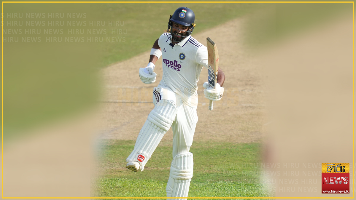
India ends Day One on 288/2 as Padikkal hits unbeaten 131
Local
15 August 2026
Army soldier dies in wild elephant attack
Local
15 August 2026

Solutions to be provided for pirate threats facing deep-sea fishermen
Local
15 August 2026
Workday buyout seen as potential boost for software valuations
Local
15 August 2026
Fire breaks out at jewellery store in Wattala
Local
15 August 2026

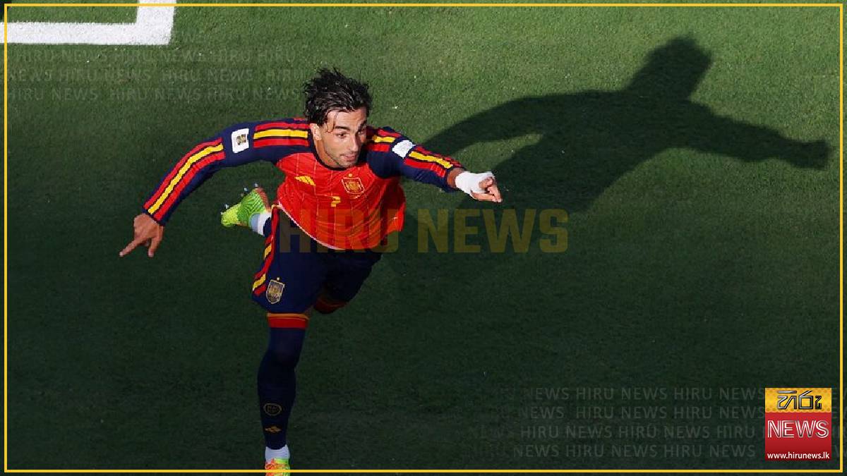
PSG sign Spain forward Torres from Barcelona
Local
15 August 2026
Indonesia earthquake death toll rises to 38
Local
15 August 2026

Suspect arrested over plot to target prison officers
Local
15 August 2026